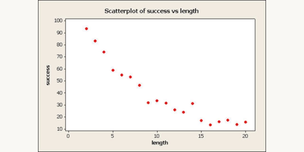
A scatter plot is a type of plot that shows the data as a collection of points. The points are placed on a coordinate grid and are used to show how two variables are related. Scatter plots are used to show the relationship between two variables, but they can also be used to show the distribution of data.
The overall trend in the data on a scatter plot can be determined by looking at the slope of the line of best fit. The scatter plot can also be used to identify outliers in the data. Scatter plots can be created in several different ways and via several different tools and programs. Keep reading to learn how to make a scatter plot.
Basics of a Scatter Plot
A scatter plot is a graphical representation of the relationship between two quantitative variables. The data are plotted on a Cartesian coordinate system, with one variable on the x-axis and the other on the y-axis. A point is then plotted for each data point, using the coordinates of the corresponding values for each variable.
Scatter plots are used to identify relationships between two variables. The pattern of points can help identify linear or nonlinear relationships, as well as correlations and outliers. If there is a linear relationship between the two variables, the points will be arranged in a line or curve. If there is no relationship between the two variables, the points will be scattered randomly throughout the graph.
Interpreting a Scatter Plot
The variables in a scatter plot can be quantitative or categorical and identify many patterns and trends. The type of relationship can be identified by the shape of a scatter plot. If the points are evenly distributed, there is no relationship between the variables. If the points are clustered together, there is a strong relationship between the variables. If the points are scattered randomly, there is no relationship between the variables.
The scatter plot can also identify the strength of the relationship between the two variables. The strength of the relationship is identified by the size of the points on the scatter plot. The direction of the relationship between the two variables could also be detected. The direction of the relationship is identified by the position of the points on the scatter plot.
The scatter plot can be used to identify the correlation between the two variables. The correlation between the two variables is identified by the correlation coefficient. Finally, the scatter plot can be used to identify the outliers between the two variables. These are identified by the points on the scatter plot.
Making a Good Scatter Plot
Now, before diving into making a scatter plot, be informed of the features of a good scatter plot. Good scatter plots should be smooth and have no gaps or spikes. The points should be evenly distributed and fall along a line or curve, indicating a strong correlation between the two variables.
There are several factors to consider when creating a one:
- The scale of each axis must be appropriate for the data.
- You cannot use a linear scale if your data is nonlinear.
- The axes should be labeled with appropriate units of measurement.
- The axes should be scaled so that all of the data fit on the graph.
- Points should be plotted accurately using ruler markings or digital measurements in software programs like Excel or SPSS).
When done correctly, scatter plots are one of the most effective ways to visualize the correlation between two variables for large quantities of data. They are simple to create and easy to understand, which makes them a popular tool for data analysis.

