-RAJESH BALKRISHNA PADALKAR
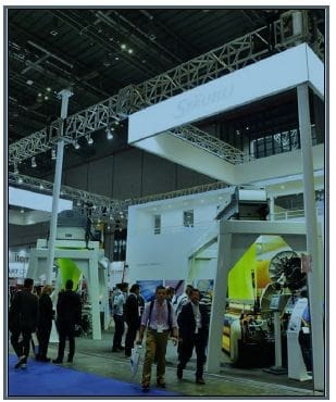
Five seconds. Yes, five seconds is the maximum attention a regular visitor may give to your stall while walking in the aisle. One basically has these five seconds to convert the regular visitor into a potential lead. Exhibitions give you the right opportunity to showcase the actual look and feel of your products. The lesser-known brands can explore such events by building visually appealing stalls and displays.
It’s the post pandemic era now. Most of the businesses and markets have opened and so are the exhibitions. Sales persons were waiting for the face-to-face experience with their clients and colleagues. Luckily the few exhibitions which happened in 2022 were a big hit as far as the foot falls were concerned.As we move ahead with few exhibition dates being announced, lets try to understand the important factors to be kept in mind regarding stall building and designs.

1.Booth space
The process of the success of your exhibition begins almost 6 to 10 months before when you book the space. One needs to have a clear-cut understanding of what “message” you want to convey to your potential clients. If you are going to have a machine displayed then definitely one needs at least 108 sqmts of space with two sides open. If it’s only an information booth then anything between 27 sqmts to 54 sqmts can be booked. Most people forget that they would like to have at least one separate meeting room and add it at the last minute when it’s too late. The design of the stall must not present a confused look at the last moment. If you know the space you are working with, the exhibition stall design will cater to that and you will be able to make full use of the available space. Otherwise, the stall will look cluttered and cramped. The visitors and the potential customers are sure to notice this fact. In short, the design of your stall must be attractive enough to get people’s attention and expansive enough to convey what your business is all about. You stall design must be attractive enough to turn up customers towards your brand and make you stand out from your competitors.

- Message and Product display
The second most important fact which needs to be frozen well in advance is the marketing message you want to inform. You need to know and attract your target audience who will later give you the ROI. The marketing strategy which might be in place in your company should be properly displayed on your stall. Your product display should reflect only one single idea – you are here to sell your product. Remember – The design must complement your product and not the other way round. People tend to get attracted to unique and attractive things. Only the unique stalls attract potential customers and generate potential leads. Therefore, planning for a perfect product display is the most important aspect of participating in an exhibition.
3.Position of the stall
Most companies want their stalls to be at the forefront of the entry gates. Remember, the exhibition organisers have the limited space of the entire hall at their disposal and have to accommodate all their clients. They generally go by the thumb rule that the larger stalls to be in front and others are clustered around them. Most organisers also go by the first come first serve basis. So, there are chances that almost more than 50% of the exhibitors will get space which they don’t like. Here is not so important as to where your stall is in the hall, but what is more important is as to how good looking and unique your product is. So instead of worrying where your stall is, you need to focus on installing an effective stall which can assure the success of your brand at the exhibition. For this, you have to think and plan about every aspect, from the look of the exhibition stand to its set up.
4.Design and Graphics
Give your customers a great first impression. The stall should be a great resource to your sales team to communicate your product or service. Your stall design should be used as an invitation to your company. Using a uniquely simple design with normal fonts and colour scheme does the job. Most companies use their company logo colour for the stall design, which is a great idea. Complicated graphics with unreadable fonts and colours isn’t great for the eyes. Always place important information at the top of the graphics and avoid have explanations in detail. In general, your graphics should have 60% images, 30% text and 10% white space.
Backlit logos and multiple display panels give your stall an eye-catching and modern look. Use of modern technology such as TV, Touch screens, Tablets and other interactive elements create an interest in the customers to spend more time on your stall. In recent times having a “selfie corner” is a great option with your company logo in the back ground. Having a mobile charging corner is another way of grabbing customer time on your booth
- Corporate branding and giveaways
On your booth, the sales team members representing your brand should dress according to your logo colour. If you are not sure what to wear, keep it professional and consistent among all members on the stall. Identifying the sales persons also becomes easy to the visitors if they are wearing a same colour uniformly. A name badge also helps during initial part of the communication. The sales team also needs to have their visiting cards printed in large numbers before the exhibitions. One more important factor of the success of your participation is the gift you give to the visitors.Focus should be on items that give your brand that extra mileage, rather than the traditional pens or key chains with your logo on it. A unique gift can leave the audience remembering you after the event. The perfect gift is one which the customer asks to give one more!

