Using Nano Banana to Sketch Out Album Cover Art for Your Indie Music Project
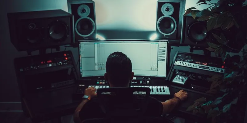
I have been making music as an indie project for about seven years. Bedroom production mostly, electronic and ambient with some softer vocal stuff layered in, released on Bandcamp and the major streaming services under a name nobody outside of about three thousand monthly listeners has ever heard. The music is the thing I care about. Everything around the music — the artwork, the visual identity, the social media presence — is the thing I have spent seven years quietly struggling with.
For most of those seven years, the covers for my releases looked like covers made by someone who knew they should look better than they did. A photograph of a sunset I had taken on my phone. A blurry close-up of fabric. A stock image with a filter on it. Each cover individually was fine. Together, my discography page looked like a yard sale of unrelated visual choices, which is exactly what it was.
This article is about how that has changed over the last year, and what I have learned along the way.
Why Album Art Matters More in the Streaming Era
There is a long-running argument that album art mattered when albums were physical objects you held in your hand, and that streaming has reduced the importance of the cover to a small thumbnail nobody really looks at. I believed some version of this argument for years. The data on my own releases finally convinced me I was wrong.
Streaming platforms are visual platforms, in a way that the music industry has not fully acknowledged. The cover is the first thing a listener sees when scrolling a playlist, browsing a genre page, or being recommended a track by the algorithm. The cover is doing the work that radio used to do — telling the listener whether this track might be something they want to spend three minutes with.
For an indie artist, the cover is even more important than it was for major labels in the physical era, because the cover is one of very few signals the listener has about whether your music is "for them." There is no DJ, no record store clerk, no curator vouching for you. The cover is the whole pitch, and the listener decides in about a second whether to click.
Indie tracks with strong cover art get added to playlists more often, get clicked on more often, and get listened to longer once clicked. None of those effects are huge in absolute terms, but they compound across a catalog, and over years they are the difference between a project that grows and a project that does not.
What the Old Options for Indie Album Art Looked Like
Before AI tools became viable, my options were the same options that every bedroom musician faces.
Commissioned cover art from an illustrator or designer was the gold standard. Real cover art from a working illustrator runs anywhere from two hundred dollars to two thousand or more per release, depending on the artist and the scope. For a major album release, that is a reasonable spend. For an indie artist releasing two singles a month for a year, the math is impossible. You would spend more on artwork than you earned from the streams.
Stock photography with type overlay was the budget option. The covers look approximately acceptable, but they look like everyone else's stock-photo covers, and they communicate "this artist used the same option a hundred other artists used." That is a quiet but real signal of low effort that listeners pick up on, even if they cannot articulate it.
Doing it yourself in Photoshop or Procreate was the option that I and most of my peers actually took. The quality varied wildly. Some indie artists are also visual artists and produced excellent covers. Most of us were not, and our covers looked like the work of musicians who had been forced to also be designers, which is exactly what it was.
There was a fourth option that I do not love but should mention, which was the "graphic design is my passion" approach — a single visual treatment applied to every release with only the title changing. This produced consistency at the cost of every release looking identical, which is its own kind of failure. None of these old options gave indie artists what they actually needed, and that gap is where Nano Banana eventually fit in for me.
Where Nano Banana Entered My Workflow
The first time I used Nano Banana for a cover, I was about to release an EP that I had been working on for almost a year. The music was darker and more atmospheric than my usual work, and I had been struggling for weeks to find an image that matched the mood. I had tried stock photos. I had tried sketches. I had tried photographing things in my apartment with dramatic lighting. Nothing landed.
I wrote out what the EP felt like, in plain language. A dimly lit underwater scene with shafts of green-blue light filtering down through still water. A sense of slow movement. A small figure barely visible in the lower third of the frame. Cold palette, slightly painterly, the kind of image that looks like a still from a film I cannot quite remember.
What Nano Banana returned was a cover. Not a draft. A cover. I cleaned it up, added the title and artist name in a typeface I had been auditioning, and shipped it as the actual EP cover. It is still the cover. It is also the strongest visual the project has had in seven years.
What an Indie Musician Actually Wants From This Workflow
The question I get most often from other indie musicians who are starting to use AI image tools is whether they should use the generated art as the final cover or as a brief for a human illustrator. The honest answer is that it depends on the release.
For singles released every few weeks as part of a streaming strategy, Nano Banana covers as final art make sense. The economics of single releases do not support custom illustration for every release. The visual quality of well-prompted generated covers is significantly better than the stock-photo alternative most indie artists would use otherwise.
For an album that represents a serious creative statement and that you want to look back on in twenty years, I still think commissioning a real illustrator is the right call. The cover should reflect the same investment the music did. Using generated art for a major album release feels like cutting a corner that did not need to be cut.
For everything between those two extremes — EPs, deluxe editions, alternative covers, regional variants — the answer depends on the release's specific role in the catalog. I usually do Nano Banana art for the streaming-only variants and commissioned art for the physical release.
Series Consistency Across a Release Cycle
The other place this workflow has changed things for me is the cohesion of my catalog.
For years I had been releasing music in visually unrelated waves. The cover for one single would look nothing like the cover for the next single. New listeners who found one track would not visually recognize the next track as coming from the same project. The lack of visual continuity was actively working against me without my realizing it.
Now I write a visual style description that applies to a whole release cycle and feed it into Nano Banana for every cover. The four singles leading up to an album all share the same color palette, the same lighting style, the same compositional approach, even though each cover features a different specific image. When the album drops, its cover sits in the same visual world as the singles that led up to it. The whole release campaign looks like a single coherent thing.
That cohesion is what major labels have always done for their artists. It used to be inaccessible to bedroom musicians because each cover was its own independent design exercise. The Nano Banana workflow makes it the default.
How Genre Aesthetics Show Up in Generated Covers
The other lesson I learned, which I had to learn the hard way, is that generated covers can fall into generic AI aesthetics if you are not specific about genre.
Ambient and electronic covers have specific visual conventions. The same is true for indie rock, for folk, for hip hop, for jazz, for metal. Each genre has visual codes that listeners recognize unconsciously, and a cover that does not respect those codes will fail to communicate genre to the listener even if the music does.
The way I prompt Nano Banana now includes genre cues. Not "ambient cover" — that produces generic ambient cover. Something more specific. "The kind of cover that would sit on a 1990s ECM jazz album." "The visual language of a 2010s 4AD release." "Like the photography on Mount Kimbie's Cold Spring Fault Less Youth." Pointing at specific reference points within the genre gives the generation enough to land in the right visual territory.
Listeners cannot articulate this, but they respond to it. A cover that visually belongs in the genre signals "this is for you" to the right listeners. A cover that visually does not belong loses those listeners before they have heard a note.
What This Cannot Replace
I want to be honest about the limits, because indie musicians who treat AI tools as a complete replacement for visual thinking end up with worse releases.
The visual identity of a project is still a creative decision that requires taste, intentionality, and an understanding of what the project is about. Nano Banana renders whatever you describe, but the description is the actual creative work, and a vague or generic description produces a vague or generic cover. The tool does not develop your aesthetic for you.
Photographs of yourself as the artist — press photos, headshots, the kind of imagery used in interviews and Wikipedia — still require real photography. Generated images of yourself look approximately right but rarely well enough for press use, and using them for artist photos starts to feel deceptive in a way that other AI uses do not.
Album art for vinyl and physical releases has technical specifications that generated images do not automatically meet — bleed areas, spine considerations, back cover composition. The cover may come from Nano Banana, but the layout still needs to go through a real designer or a careful self-assembly in design software.
And the music itself, obviously, is still the actual product. A great cover on a mediocre album is still a mediocre album. The tools help with visual presentation. They do not help with making the music better, which is the work that actually matters.
Why This Quietly Changes the Indie Music Landscape
The independent music scene has historically been gated, in a quiet way, by visual capacity. The artists who consistently looked professional were either the ones with friends in design or the ones with the budget to commission good cover art. The rest of us looked like what we were, which was musicians doing our best with limited resources.
That gap is narrower now. An indie artist with good taste and a willingness to iterate can produce cover art that holds its own next to label releases, at a fraction of the cost. The music still has to be there. The marketing still has to be done. But the visual presentation no longer requires a separate skill set or a separate budget line.
For a generation of bedroom producers and indie songwriters who have been making music despite the visual barriers rather than because the visual side was figured out, this shift matters. The next few years of indie music are going to look more visually ambitious than the last decade did, and the artists making that happen are going to be the same artists who have always been there, finally able to present their work in a way that matches the work itself.