Dr Mrs Ela Dedhia
Associate Professor,
Textiles & Fashion Technology
Nirmala Niketan College of Home Science
49, New Marine Lines, Mumbai 400020
The first contact between a Customer and a Brand is Colour. The easiest way to make a Brand DISTINCTIVE is through selective use of Colour. Color is at the heart of the Marketing Mix. There are 171476 words to choose a Brand name but there are only few colors to choose.
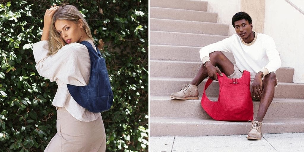
Blue: Cool blue is perceived as trustworthy, dependable, fiscally responsible and secure. Strongly associated with the sky and sea, blue is serene and universally well-liked. Blue is a especially popular color with financial institutions, as its message of stability inspires trust. BLUE is focused behind the retina appears to move away from you and is considered to increase feeling of Peacefulness, Confidence and Tranquility.
Red: Red activates your pituitary gland, increasing your heart rate and causing you to breathe more rapidly. This visceral response makes red aggressive, energetic, provocative and attention-grabbing. Count on red to evoke a passionate response, but not always a favorable one. For example, red can represent danger or indebtedness. Red is focused in front of the retina appears to move towards you. Red= Energy / Excitement. 45% of the flags have red in them.
Green: In general, green connotes health, freshness and serenity. However, green’s meaning varies with its many shades. Deeper greens are associated with wealth or prestige, while light greens are calming. 20% of the flags have Green in them which is considered more like Blue Corporate Color. Green indicates Health and Wellbeing.
Yellow: In every society, yellow is associated with the sun. Thus, it communicates optimism, positivism, light and warmth. Certain shades seem to motivate and stimulate creative thought and energy. The eye sees bright yellows before any other color, making them great for point-of-purchase displays. Yellow indicates Brightness for Caution.
Purple: Purple is a color favored by creative types. With its blend of passionate red and tranquil blue, it evokes mystery, sophistication, spirituality and royalty. Lavender evokes nostalgia and sentimentality.
Pink: Pink’s message varies by intensity. Hot pinks convey energy, youthfulness, fun and excitement and are recommended for less expensive or trendy products for women or girls. Dusty pinks appear sentimental. Lighter pinks are more romantic.
Orange: Cheerful orange evokes exuberance, fun and vitality. With the drama of red plus the cheer of yellow, orange is viewed as gregarious and often childlike. Research indicates its lighter shades appeal to an upscale market. Peach tones work well with health care, restaurants and beauty salons. In Retail it is considered a color to increase POS (point of sale).
Brown: This earthy color conveys simplicity, durability and stability. It can also elicit a negative response from consumers who relate to it as dirty. Certain shades of brown, like terracotta, can convey an upscale look. From a functional perspective, brown tends to hide dirt, making it a logical choice for some trucking and industrial companies.
Black: Black is serious, bold, powerful and classic. It creates drama and connotes sophistication. Black stands for Luxury. Black works well for expensive products, but can also make a product look heavy.
White: White connotes simplicity, cleanliness and purity. The human eye views white as a brilliant color, so it immediately catches the eye in signage. White is often used with infant and health-related products.
All the colors above can be categorized into two basic categories: warm and cold. In general, warm colors, like red and yellow, send an outgoing, energetic message, while cool colors, like blue, are calmer and more reserved. However, brightening a cool color increases its vibrancy and reduces its reserve.
Colours in Branding:
Leaders have first choice of color selection. New competitors should choose the opposite color to differentiate. A brand should use a color that is the opposite of its major competitors. By standardizing on a single color and using it consistently over the years, one can build a powerful visual presence in a clutter-filled world. Law of color=Law of difference= Law of ONE. Leaders / First mover have the first choice.
This color becomes symbolic of the category. Brand extensions which use many colors destroy core color identity of brand. It is better to stick to one of the basic 5 colors rather than the intermediate or mixer. If you copy color of the leader then competition signifies that you are only copy/me-too. Leader / First mover must useà GREEN, Next: Powerful à RED, Next : No maintenance à BLUE. If you are first mover, choose what you like or the most obvious color. Be Opposite thus be Be Distinctive.
Color is a crucial element of a brand identity. One immediately associates the product or service with a particular colour. Color scheme can make one to leave immediately or to stay for a minute if it looks appealing. Color evokes positive associations and thus forms an initial opinion of the brand. The choice of your brand color can thus stand for:
- your new visitors’ enrollment and participation (by attracting their attention);
- your brand awareness (by sticking into memory);
- your brand positive or negative associations (by boosting memories of what people like/dislike).
- Color is a powerful promotional tool
- Colors should be trendy and catchy
Personal Approach to a Brand Color:
Color perception is very individual. The favorite color for most is blue. Whenever we see a blue thing, we are going to like it. It becomes an integral part of our personality.
Modern Approach to Brand Colors:
Everything has got much brighter recently. There is no boring fixed color limitations. Pink is used for women’s magazines or an online marketing blog. Colorful logos have become a new fashion trend.
Bottom-Line
What is more important is to be consistent and original in colorizing your brand. People will remember your product at first glance if you put a little thought and effort in designing it. Consideration while choosing your brand color:
- Color can get people interested in your product;
- Color will make people remember your product;
- Brand color can be a niche marketing tool the way a movie poster finds the movie audience:
Colour for corporate brand identity
Choice of color can be very important in corporate identity branding. The mind has so many associations with different colors.
Blue is the shortest wavelength, which is highly absorbed by human eye and its not therefore acceptable by mind, immediately they seek for next longest wavelength (Green, Yellow, Orange and Red). Red has the highest wavelength, it is easily accepted by human eye, so its more attractive and easily understandable by brain.
Its how we manipulate the wavelengths, is how we generate brand color management!!
People naturally respond to color in three dimensions:
Hue: Pure spectrum colors, such as red, blue or yellow.
Saturation: The intensity of a hue (richness).
Value: Lightness and darkness.
Color is extremely complex and can also have many influences. Is beige a warm color or a slight grey cool color when viewed under different lighting conditions?
Studies have shown that bright warm colors (red, orange and yellow) are known to stimulate excitement and generate activity. This is why kids toys and clothes are often packaged in these colors. In order to imply speed and efficiency, most fast-food branding consists of these bright colors as well.
Warm colors can also cause a different response based on the value. Restaurants that want to convey comfort will choose deep warm colors, such as burgundy or burnt orange to increase longevity – which in turn increases the chance of ordering additional treats. Coffee, dessert….
On to the cooler side of things, ever wonder why performers wait in a designated area called The Green Room? Light cool colors (green, blue) are known to have a calming effect.
We associate green to grass and the outdoors. Blues are representative of the sky and ocean. With these built-in instincts to understanding color, it’s no surprise that many health and beauty products apply these colors to their branding efforts.
These same cool colors displayed in a deeper value represent another meaning as well.
Subdued blues, for instance, are considered to be professional and trustworthy. Financial institutions often use blue for this reason. Many uniforms are also in a dark blue, such as those used by the police. Deeper greens are associated to wealth and quality; hence the color of money.
Given these implications, it’s important to understand that color plays a critical role in memory recall, which makes color consistency in branding a critical necessity.
The examples above only touch on the fundamentals of color and psychology. Every good designer should understand these basics and apply the best colors needed for their products and target markets.
References:
- Collectif, 2009 Branding by colour, Pie Books.
- Marty Neumeier, 2006, Zag: The #1 Strategy of High-Performance Brands, Peachpit Press.
- Martin Lindstrom, Brand Sense: Build Powerful Brands through Touch, Taste, Smell, Sight, and Sound, 2005, Free Press.
- brandingstrategyinsider.com/2006/11/brand_identity_.html
www.entrepreneur.com/article/175428 – 74k
General “Color in Business” Theory:
| Group | Color | Associations | Nature of associations | Recommended for |
| cool (calming) | Blue | secure and trustworthy | sky (therefore universally liked) | business related websites (e.g. banks) |
| Green | wealth (deep green) | money (“the color of success”) | finance related websites (e.g. Forex related) | |
| calming (light green) | trees, spring | entertainment and leisure related websites | ||
| warm (exciting) | Red | grabs attention and makes you energetic (by activating your pituitary gland) | power (e.g. red carpet) | eye-catching logos, calls to action |
| Yellow | optimism | sun | attention grabbing (esp. using it in contrast with other color) | |
| Pink | energy (hot pink) | feminine color | products for young women | |
| romantic (lighter pink) | products for girls | |||
| Orange | cheerful | citrus fruit | kids’ | |
| neutral | Black | powerful | “absence of color” | expensive products |
| White | simplicity and purity (catches the eye) | numerous (from brides to hospitals) | health related products |