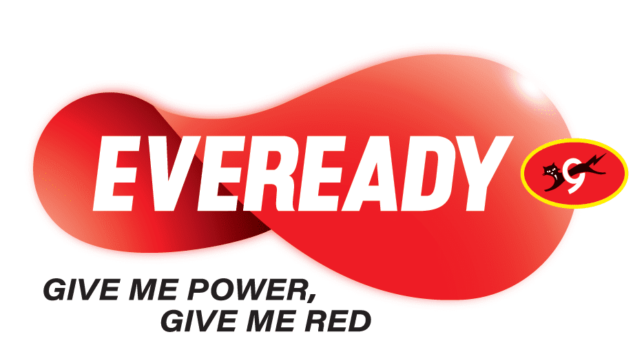
Eveready’s revamped logo marks a strategic brand transformation, forging a future-ready, self-aware brand committed to trust, quality, innovation, collaboration and care
The new logo reflects inspiration from the infinity loop which transforms into a fluid shape symbolizing an endless source of power and energy
Eveready Industries India Ltd. (EIIL, a prominent player in batteries, flashlights, and emerging lighting solutions) unveils its new brand logo and tag line, connecting the new generation with its power of infinite possibilities in the future. For over 100 years, Eveready has been an inseparable part of the daily lives of millions of Indians. The iconic ‘Eveready’ logotype held within the Red Ellipse or a ‘disc power button’ brought together the typeface and the Cat-O-9 reflecting strong cues of energy and authority. The brand synonymous with ‘Give Me Red’ which started off describing a battery ended up defining a generation. The words that have built the history of Indias biggest battery brand transcended the boundaries of advertising and became a youth slogan in the 90’s: it was about an attitude, an endless craving for the power to express youthful energy. Marking an era of excellence and with new products coming in for new age consumers, the brand identity and tag line needed to be dynamic and relevant. Drawing from the brand’s inherent association of ‘power/energy’ a contemporary new identity has been created signaling infinite possibilities and transformation towards a future committed to innovation, vibrancy, modernity, trust and empathy.
Eveready’s New Brand Logo reflects inspiration from the infinity loop which transforms into a fluid shape symbolizing an endless source of power and energy
While retaining the ‘Cat-O-9’ unit which has been a defining image of the brand, the revamped Eveready logo marks a strategic drive; it derives its inspiration from the loop of infinity. It becomes fluid, animated and dynamic, symbolizing endless source of power and energy. It is marked by intentional asymmetry; the left side is slightly smaller than the right. The design is denotative of progress – from uncertainty to empowerment. Positioned at the centre, the Eveready wordmark radiates vitality. This transformation bespeaks a future-ready, self-aware brand, one that embodies boldness and magnetism. The tagline Give Me Power. Give Me Red. reinforces Evereadys identity as an unwavering source of strength and resilience. With this bold new addition, the brand transcends the boundaries of illumination and becomes power incarnate. It becomes a synonym of empowerment and courage.
Speaking about the rebranding, Anirban Banerjee, Sr. Vice President & SBU Head (Batteries & Flashlights) of Eveready Industries India Ltd. said, “The iconic Eveready brand has enhanced its respect, reach and recall over time, matching its products and quality with the best in the world. With evolving consumer needs, the brand needed to transform and expand its portfolio, offering powerful, premium and innovative products. It was thus important for the brand to be seen as relevant and contemporary across age groups in the new world as it straddled the new portfolios.”
“What happens when you pass energy through the Eveready disc It starts to move and gather momentum. As the pace of the spin increases, the moving shape assumes the form of an infinity symbol. The new logo in motion stands for the brand’s vision of limitless progress and infinite power,” added Mr. Banerjee.
“Eveready stands for limitless power and dynamic possibilities. It is ever evolving, constantly changing and forever transforming to keep India moving towards exponential progress. This zest for dynamism, infinite energy and endless possibilities finds form in the newly revamped Eveready logo. The new logo is a symbol of power without a pause. Revamped and animated, it evokes the idea of momentum, forever on the go. It forms the loop of infinity, to denote eternal drive, the spark of new beginnings. That’s why the latest rendition of the logo comes with an additional line: give me power. Eveready is the future of power. Infinity is the soul of new Eveready,” said Sukesh Nayak, CCO, Ogilvy India.
Link to the video:youtu.be/Q_U6TalVbjcsi=Bm0DHq2HeUC19FFN
About Eveready Industries India Limited
With a legacy of over 100 years, Eveready Industries India Ltd. (NSE Code: EVEREADY, BSE Code: 531508) is a household name in batteries and flashlights, with emerging presence in lighting. Eveready products were first sold in India in 1905, which marked the beginning of the Eveready adventure. The Company, which was eventually founded in 1934, quickly rose to the top of the dry cell battery market. It is a leading brand in enhancing peoples quality of life with innovative, transportable energy and lighting solutions. With over 50% of its share in the Indian consumer battery market, Eveready has long become a name synonymous with the category. The brand’s legendary catchphrase “Give Me Red” continues to resonate with the consumers even after decades of its inception. The Company’s manufacturing facilities are spread across 6 locations, namely Matia, Lucknow, Noida, Haridwar, Maddur and Kolkata. They are equipped with globally benchmarked technology platforms and follow the best-in-class operating standards, with relentless focus on quality (ISO 9000), environmental best practices (ISO 14000) and rapid adoption of technology. The Company has a Research and Development (R&D) facility which is approved by the Department of Scientific and Industrial Research (DSIR), Ministry of Science and Technology, Government of India.
For more information, please visitwww.evereadyindia.com.

