How to Evaluate Textile Print Concepts Before Making a Physical Sample
A print can look balanced on a flat artwork file and still behave badly once it is placed on a garment. A large motif may disappear into a side seam, a border may land awkwardly across the bust, or a dense repeat may make a simple silhouette feel visually heavy. These issues are easy to miss when decisions are made from a swatch alone, yet discovering them after a sample is cut turns a visual question into another round of material, labour, and approval.
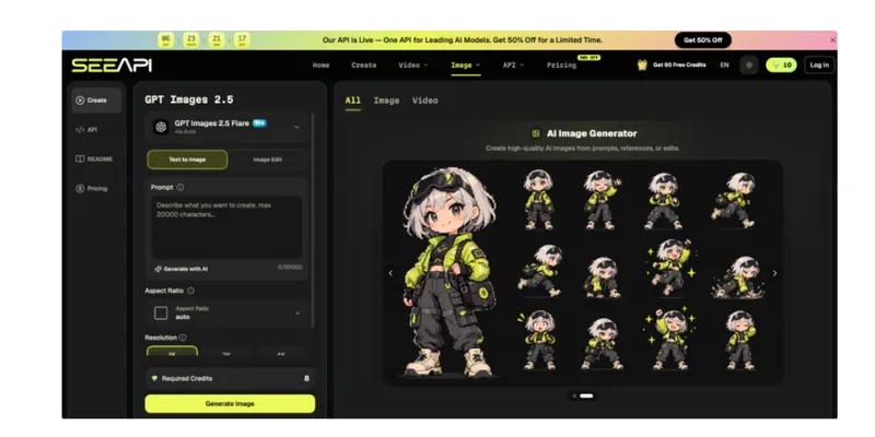
Early visualisation is useful because it lets a team test the relationship between artwork and garment before asking a physical sample to answer every question. It should not be treated as proof of drape, colour accuracy, fit, or print registration. Instead, it is a decision layer for judging scale, placement, balance, and styling direction. When a reference artwork needs to be explored in a garment scene, ChatGPT Images 2.5 API can be considered as one route for creating or refining an image from a text brief and reference input. The useful result is not the most polished picture, but the one that helps identify what should be sampled next.
Define What the Preview Must Prove
Start by writing the decision the preview is meant to support. “See how the print looks on a dress” is too vague. A more useful brief is “compare whether the floral repeat reads better at 8 cm or 14 cm across the front panel” or “check whether the border should end above or below the hem break.” A specific decision determines what the visual must show and prevents styling details from distracting the review.
Separate visual questions from technical questions at this stage. A concept image can help assess motif prominence, colour relationships, placement zones, and overall proportion. It cannot confirm fabric hand, shrinkage, fastness, stretch recovery, exact colour under production conditions, or how a repeat will register across cut panels. Those points still belong to physical samples, production files, test data, and supplier confirmation.
Create a short review note beside each concept: what is fixed, what is being tested, and what remains unverified. This keeps an attractive preview from becoming an accidental production instruction
Build a Controlled Print Placement Test
A useful placement test changes as little as possible between versions. If the garment pose, background, colour, print scale, and styling all change at once, reviewers cannot tell which change improved the concept.
- Prepare the Source Artwork
Begin with the cleanest available artwork or swatch image. Identify the repeat unit, border, engineered motif, or placement graphic that matters. If several colourways exist, select one for the first test.
Record the motif dimensions or intended repeat size separately from the visual file. A generated or mocked-up preview can suggest proportion, but the production team still needs numerical dimensions. Keep the artwork file and the review image as two different assets with different purposes.
- Fix Scale Before Styling
Test print scale before experimenting with dramatic lighting or elaborate settings. Apply the same garment silhouette to two or three scale options and compare them side by side. Look at where the eye lands first, whether recognisable motifs become fragmented, and whether large empty areas appear unintentionally around seams or closures.
For an all-over floral print, a small repeat may create even surface activity while a larger repeat turns individual flowers into dominant elements. The choice depends on the intended garment, panel size, and visual hierarchy.
- Test Placement on Garment Views
Once the scale range is narrowed, place the chosen direction on the garment views that expose likely problems. A front view can reveal neckline and centre-front conflicts; a back view may show whether a large motif is cut by a yoke; a three-quarter view helps identify how the print reads as panels turn around the body.
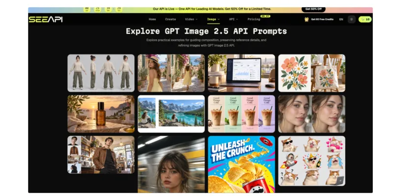
When creating an exploratory visual, ChatGPT Image 2.5 can take a written instruction together with a reference image. Provide the source textile artwork, name the garment silhouette, and describe the intended placement or approximate visual scale. Use the output to compare composition, then inspect whether defining motifs, garment proportions, and placement zones have drifted. Any detail that appears plausible but was not supplied should be treated as illustrative rather than approved production information.
- Compare Variations Against One Standard
Place the shortlisted versions in the same layout and review them against identical questions. Does the focal motif land in an intentional area? Does the repeat feel too dense near construction lines? Does the print overpower the silhouette? Can the design survive likely cropping in a line sheet or buyer presentation?
Avoid choosing a version because its model, pose, or background is more appealing. If necessary, crop the previews to show only the garment. The comparison should reward the textile decision, not the surrounding image.
Separate Visual Appeal From Production Accuracy
A convincing concept can create false confidence. Surface texture, shadows, folds, and lighting may make a preview feel physically accurate even when the underlying print has been distorted. Treat realism as presentation quality, not as evidence that the design is ready for manufacturing.
Check the concept against the original artwork at three levels. First, compare colour families without assuming screen colour equals production colour. Second, inspect motif geometry: circles should not become ovals, lettering should not mutate, and directional motifs should not rotate unexpectedly. Third, inspect continuity near seams and folds. A preview can help flag awkward areas, but only the actual pattern pieces and print-production method can determine how alignment will work.
This distinction matters especially for engineered placements, borders, stripes, checks, and other designs where small positional changes are visible. If the commercial idea depends on matching across seams, move from the visual concept into CAD, pattern, marker, and supplier checks before approval. The preview has completed its job once it exposes the question clearly enough for the correct technical process to answer it.
Review the Concept Before Sampling
Before sending a design forward, run a short decision review with the artwork, preview, and intended garment together. Ask reviewers to identify the preferred scale and placement without seeing which version was created first. If they cannot explain the choice in textile terms, the concepts may still contain too much styling noise.
Look for three signals that a direction is ready to sample: the intended focal area is consistent across views, the artwork remains recognisable, and the remaining uncertainties are physical or technical rather than basic compositional questions. A concept needs more work when reviewers disagree about what the main motif is, when important elements repeatedly fall into construction zones, or when each new image changes the garment itself.
Also define what the physical sample must test. That might include real colour, fabric drape, border position after cutting, seam matching, or the interaction between print and a pocket. A sample is more valuable when it enters production with a list of unresolved questions rather than a vague instruction to “see how it looks.”
Use Previews to Make Better Sample Decisions
The strongest pre-sampling workflow does not try to replace fabric, pattern engineering, or production testing with a realistic image. It uses visualisation to remove avoidable uncertainty before those more expensive stages begin. Define the decision first, keep source artwork separate from the preview, compare scale and placement under controlled conditions, and mark every technical property that the image cannot verify. A preview earns its place when it helps the team reject weak directions or prepare a more precise sample request.
Over repeated projects, save the decisions as well as the images. Record which scale was selected, which placement failed, what the physical sample later revealed, and which visual cues proved misleading. That history gradually creates a more useful internal reference for future prints and garment types. Instead of treating each new artwork as a fresh guessing exercise, the team builds a disciplined path from flat design to visual concept to verified sample, with each stage answering the questions it is actually equipped to answer.