A Fabric Collection Needs a Moving Introduction, and Seedance 3.0 Offers a Starting Point
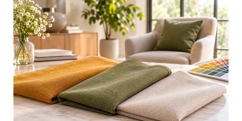
A row of folded swatches can communicate colour, yet it rarely communicates the feeling of a collection. For a proposed presentation video for an upholstery textile supplier, I would begin with three fabric samples laid across a broad worktable. The camera would move slowly from a warm ochre weave to a muted green and then a pale neutral. The film would introduce the collection's visual character before the buyer turns to specifications and physical samples.
I would keep the purpose narrow. This would be a creative introduction to a proposed range, not a substitute for testing abrasion resistance, colourfastness, or fibre composition. Those details belong in verified product documentation. The moving sequence should make the materials inviting to explore while leaving technical claims to reliable evidence. That boundary would influence the shots themselves: broad folds and colour relationships are appropriate subjects, while an invented close-up of exact weave structure could mislead.
Organize the samples as a visual conversation
My reference photograph would show the three fabrics under the same light, with enough space between them to preserve their separate identities. I would avoid combining catalogue images shot under different conditions because the resulting palette could feel inconsistent before any movement is added. One sample would lead the frame, another would provide contrast, and the third would give the eye a quieter place to rest. The arrangement would resemble a designer's working table rather than a crowded warehouse shelf.
A second image could show the collection's intended interior setting: perhaps a simple lounge chair near a large window. I would treat that as atmosphere rather than proof that the actual fabrics had been manufactured into that exact chair. If the supplier already had real installation photographs, those could become separate, accurately identified parts of the finished edit. The generated concept should not blur the distinction between an imagined application and a documented customer project.
For the transition between table and room, seedance 3.0 would give me a way to explore movement from selected visual references. The AI video model supports text-to-video, image-to-video, and reference-based generation combining text, images, video, and audio. My plan would assign each input a specific job: the sample photograph establishes the palette, the room image suggests context, and the written direction explains the camera movement I want to explore.
Let light reveal the folds
The first Seedance 3.0 shot would stay close to the sample table. I would ask for a restrained sideways camera movement, diffuse light from one direction, and fabrics that remain still. Moving the camera while keeping the material quiet would make the scene easier to judge. An elaborate wave travelling through every sample might look dramatic, but it would also imply material behaviour that the video cannot establish accurately.
My shot brief would describe “three upholstery fabric samples arranged in broad folds on a plain worktable, ochre, muted green, and warm ivory, soft side light, slow lateral framing, calm showroom atmosphere.” I would use that direction to explore composition, not as an assurance of colour accuracy. Before publication, the supplier would still need to compare any depicted colours with approved photographs and physical samples. A screen cannot replace the tactile and visual judgment involved in textile selection.
I would give the darker sample enough light to retain visible structure without making the pale sample appear blown out. If the scene became too glossy, I would revise the lighting description toward a softer, more even treatment. Seedance 3.0 could help me explore the mood of the presentation, but the creative goal would remain modest: make the folds readable and the relationship between colours clear. More shine would not automatically make the fabric look more desirable.
Move from the table to an imagined room
The second part of the video would introduce an interior concept built around the green fabric. I would choose a simple chair shape and keep other furniture understated. The viewer should be able to connect the colour on the worktable with the broader room mood. I would not attempt a seamless transformation from loose fabric into a finished chair, because that could turn a practical collection introduction into a distracting visual trick.
A short reference video could suggest the pace of a slow showroom reveal. Within a Seedance 3.0 reference workflow, that clip would contribute timing rather than dictate every object in the room. I would use material I had permission to supply and avoid copying another brand's distinctive campaign. A quiet audio passage might also establish rhythm, but I would complete the soundtrack and final synchronization in an editor rather than assume those elements are already resolved by generation.
Correct the sample before extending the sequence
If the first result changed the green fabric into a patterned textile halfway through the shot, I would reject that section. The revision would simplify the scene and reinforce the intended plain appearance. My next Seedance 3.0 attempt would retain the same camera direction while reducing the number of competing textures in the background. That would let me compare the effect of one meaningful change instead of rebuilding the entire concept after each attempt.
I would also inspect the edges of the samples. A fold that merges into the table or a corner that repeatedly changes shape could undermine the sense of material even if the overall colour looks attractive. A shorter clip might preserve a useful opening, but persistent distortion would require another approach. Real footage of a sample moving under controlled light could replace the difficult section, while generated imagery remains in the wider conceptual scene where exact construction is less central.
Make the video useful at a buyer meeting
The final edit would alternate a clear view of the swatches with the imagined interior, then return to the full palette. Seedance 3.0 would support the visual exploration, while conventional editing would handle labels, transitions, and sound. I would add collection names and sample codes as separate text layers using verified information from the supplier. Those identifiers should remain stable and readable, especially when a buyer pauses the presentation to request a sample.
I would deliver a short version that works silently on a showroom display and a narrated version for a sales presentation. Neither would need rapid cuts or extravagant claims. The useful result would be a moving introduction that helps a buyer understand the collection's visual direction, then invites a closer look at real material. The table, the folds, and the room would carry one coherent idea: these colours belong together, and this is the atmosphere a designer might explore with them.